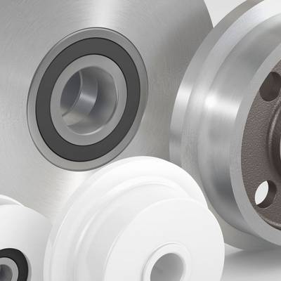
FR. Meyer's Sohn: Forwarding Business
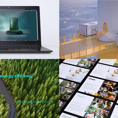
Fr. Meyer's Sohn is a classic "hidden" champion. They aren't known to the public, yet this medium sized business is one of the world's largest independent sea freight forwarders and the largest paper and cellulose forwarder. The company planned to communicate this leading position to a wider market in the course of a strategic rebranding. But one thing you need for such an undertaking is a modern and bold appearance - which is where we came in.
The company's name, Fr. Meyer's Sohn, formed the core of the new branding, as a replacement for the formerly used abbreviation, "FMS". We developed a detailed corporate design including a new claim: Forwarding Business. A highlight of this brand relaunch was the image brochure, with its unusual format that allows easy adaption to suit different target groups.

Berliner Type Award 2017
diploma for exceptional realisation

An extraordinary name at the core of the brand.


Who said brochures always have to have a binding?


![[Translate to Englisch:]](/fileadmin/_processed_/c/2/csm_RosenbauerSolbach-B2B-Albis_01_4fd8a09716.jpg)
![[Translate to Englisch:]](/fileadmin/_processed_/3/9/csm_RosenbauerSolbach-B2B-Albis_02_5b2c043289.jpg)

![[Translate to Englisch:]](/fileadmin/_processed_/3/c/csm_RosenbauerSolbach-B2B-BMA_7a5b9851f9.jpg)

![[Translate to Englisch:]](/fileadmin/_processed_/0/6/csm_RosenbauerSolbach-B2B-IKB-Leasing-Flowgeschaeft-1_web_0d63a98f34.jpeg)

![[Translate to Englisch:]](/fileadmin/_processed_/c/9/csm_IndivuType_Keyvisual_2019_RGB_05b75e990a.jpg)
![[Translate to Englisch:]](/fileadmin/_processed_/9/4/csm_RosenbauerSolbach-B2B-Inometa_5a923c59d7.jpg)
![[Translate to Englisch:]](/fileadmin/_processed_/b/3/csm_RosenbauerSolbach-B2B_Jastram-manoevring-competence_header-propeller_9e94b129ff.jpg)

![[Translate to Englisch:]](/fileadmin/_processed_/0/5/csm_RosenbauerSolbach-B2B-Mediaform_beecff8b02.jpg)
![[Translate to Englisch:]](/fileadmin/_processed_/8/6/csm_RosenbauerSolbach-B2B-Mediaform_02_0658607901.jpg)
![[Translate to Englisch:]](/fileadmin/_processed_/d/d/csm_RosenbauerSolbach-B2B-Plixxent-Kachel_44e67c7faf.jpg)
![[Translate to Englisch:]](/fileadmin/_processed_/e/4/csm_RosenbauerSolbach-B2B-Quickmix_2e4a19796b.jpg)
![[Translate to Englisch:]](/fileadmin/_processed_/9/8/csm_RosenbauerSolbach-B2B-Raeder_Vogel_d612f33061.jpg)


![[Translate to Englisch:]](/fileadmin/_processed_/7/e/csm_RosenbauerSolbach-B2B-VIEBROCKHAUS_Einfach_erkla__rt_577b732993.jpg)
![[Translate to Englisch:]](/fileadmin/_processed_/f/0/csm_RosenbauerSolbach-B2B-Viebrock_Kampagne_a77fc634ab.jpg)
![[Translate to Englisch:]](/fileadmin/_processed_/8/b/csm_RosenbauerSolbach-B2B-Worlee-Chemie_Bildkonzept-Mitten-im-Leben-header_08aafca0a5.jpg)
![[Translate to Englisch:]](/fileadmin/_processed_/d/2/csm_RosenbauerSolbach-B2B-Yxlon_9d01fbc624.jpg)